Normal Redi & Iso Omena
Normal is a fast-growing Danish company that was covered in the previous post. This time we went to see what a Normal store looks like and what are the key components of their concept.
Normal stores are normally located on high foot traffic locations in big shopping centres. This is expensive in terms of rents per square meter, but the small foot print of the stores enables rather low rents. Central locations inside big shopping centres mean there is a lot of footfall near the stores.
Especially shopping center locations make sure Normal is easily accessible to younger customers who seem to be an important customer segment for Normal.
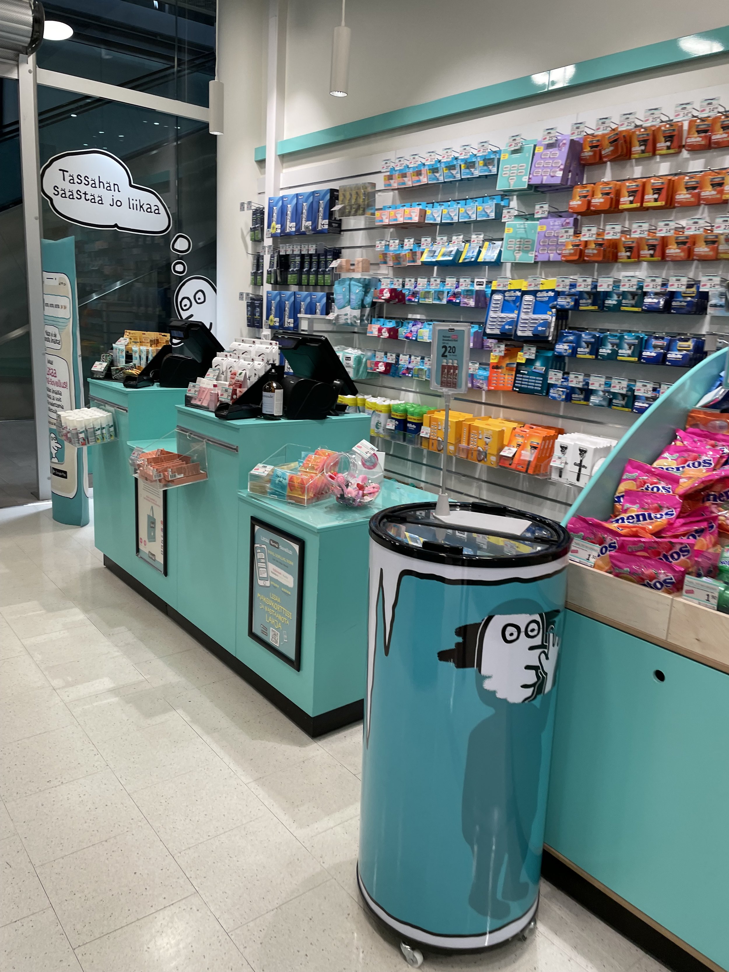
Entrance
At the entrance there is not much the customer can see. This is due to the strict format where customer is forced to walk on a dedicated route inside the store. The froced layout is made famous by IKEA. Also Clas Ohlson, XXL and Flying Tiger use similar concept. This way the customer is forced to face the whole assortment.
This is very different to traditional stores (especially big grocery stores) where customer faces only a fraction of products during their visit (some studies indicate that customers see only few hundred products out of the thousands of products in traditional stores).
The forced layout can lead to somewhat longer shopping times for customers, but that can also easily lead to bigger average basket sizes.
One benefit of the forced layout is that the store is easy for the customer view at a glance (a suggestion given to Steve Jobs by the legendary fashion merchant Mickey Drexler while building the first Apple Store). From the entrance customer can see the entire store. This makes it easy to navigate the store.
Concept and assortment
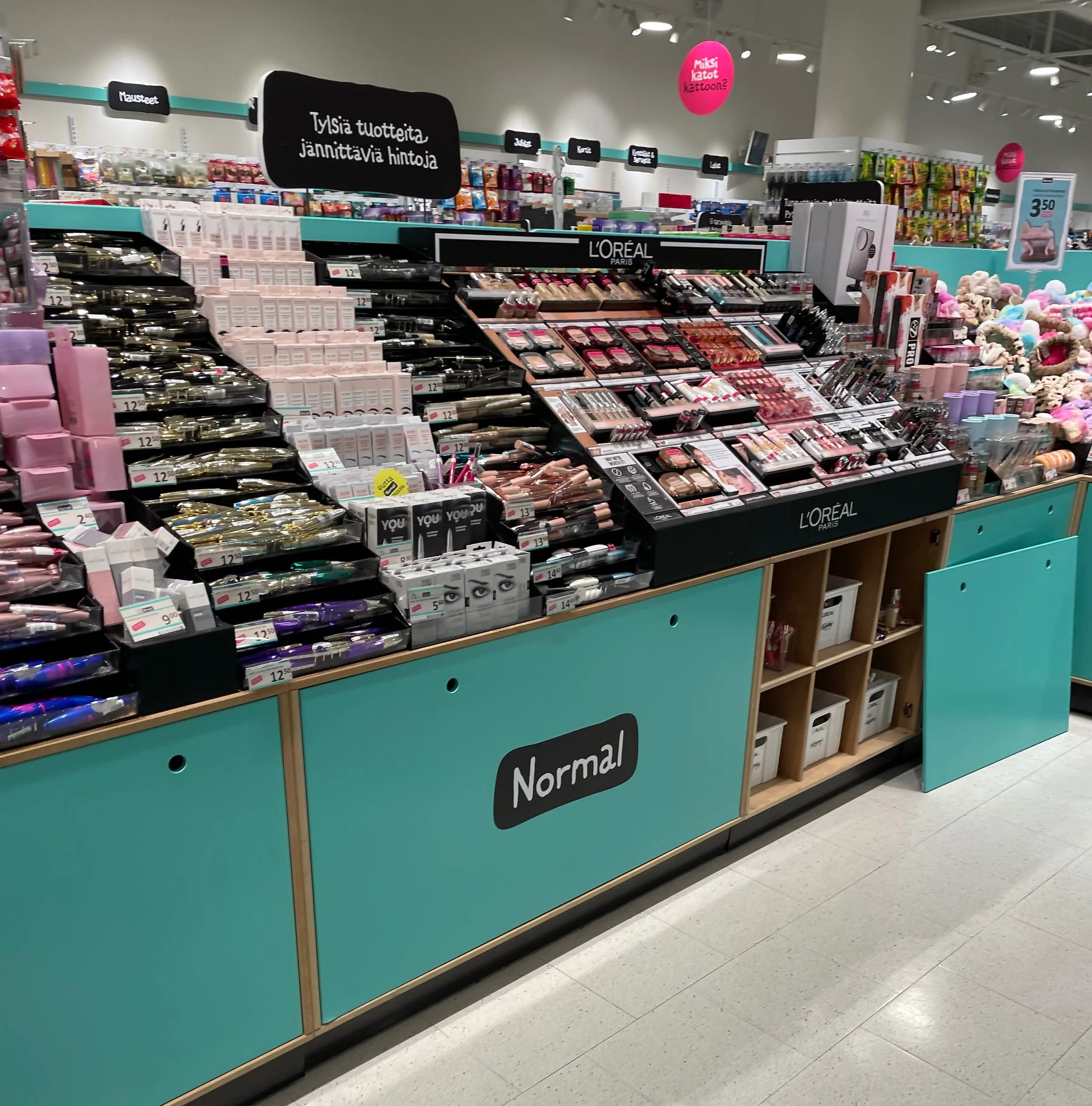
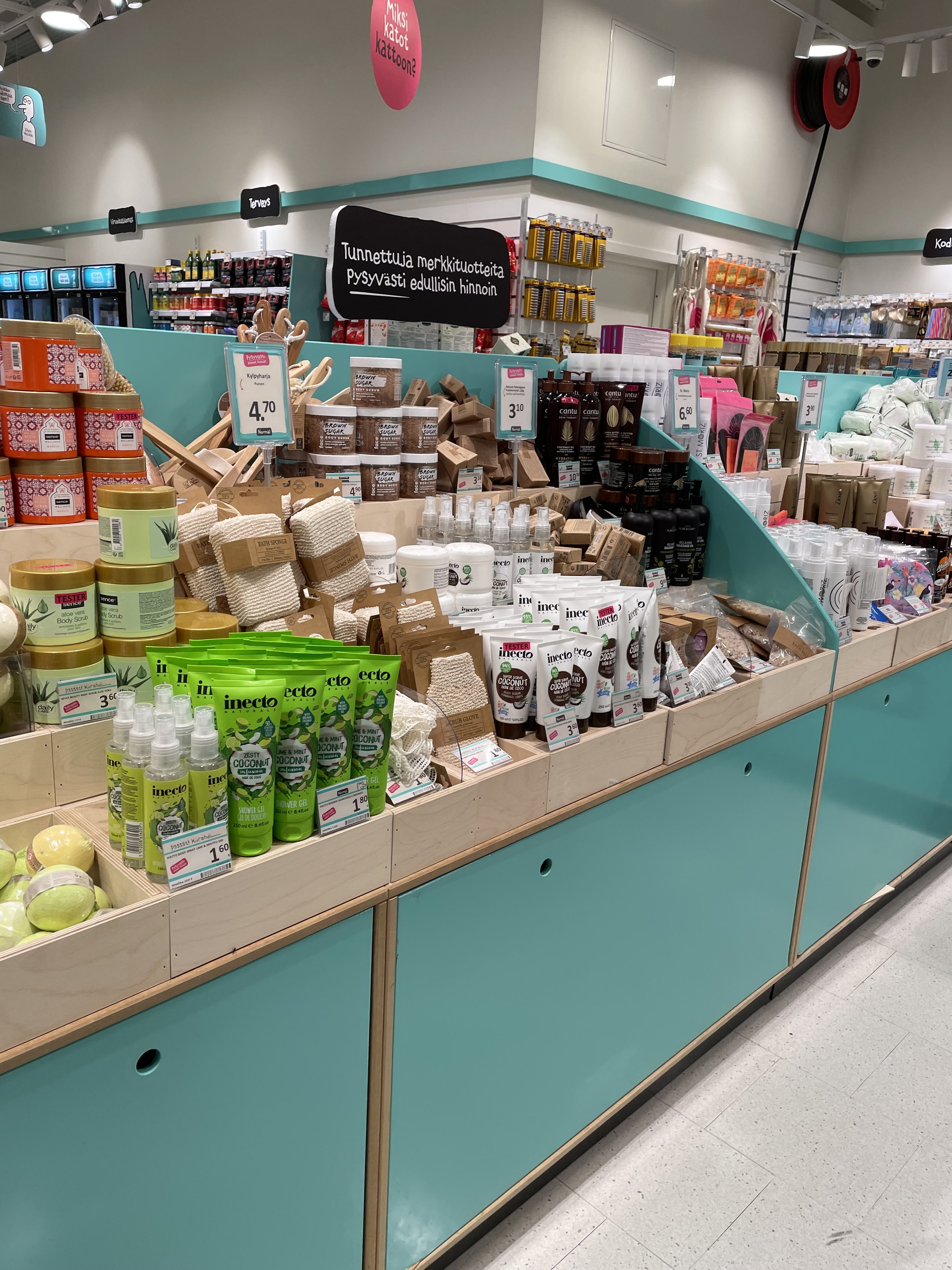
The concept of Normal is very strict. The merchandise is placed in a way that small amount of products give an impression of abundancy. This is thanks to the shop furniture, which present the products in a pyramid way making it seem there is more merchandise than there actually is.
The forced layout includes a lot of corners, which provide ample selling space. One gets a feeling that the store is much more efficiently filled with products than a traditional store.
Also the clever use retail space in the store drives additional sales. For example the products usually have another product next to it that is somehow related to the first product. For instance you could find a razor and shaving gel next to each other. This thinking goes through the whole selection.
The assortment can be divided in few categories: cosmetics and make-up, cleaning, toys, candy and food products and other products such as home exercise products. Normal clearly takes the best out of every category with having usually only the best selling options.
The forced layout also is only possible to do with somewhat small assortments (or in a very big store like IKEA). Normal seems to carry rather few different products. Unfortunately they don’t share how many products they sell.
There are also some products that give the feeling of inspirational and drive impulse buying which seems to be the tactic for Normal. Once the customer is inside the store, likely the basket has quite many impulse purchases.
The pricing in Normal is surprisingly competitive. Many products (selected randomly) had prices comparable or lower to the hypermarket Prisma or discount store Tokmanni.
Summary
All in all Normal presents a very nice and quick shopping experience, as the stores are quite small and easy to navigate. Also the assortment seems efficient in a way it is easy to see what is available.
The forced layout is an interesting concept made famous (and really successful) by IKEA, but utilised by really few other retailers. The layout has some drawbacks, but also significant benefits. At Normal the customer doesn’t need to think where to navigate to find a product. This removes a lot of the mental load from the customer journey. Always when mental load is removed and customer is more relaxed, she tends to buy more.
----------------
Would you like to learn more about interesting stores?
We conduct store tours and trend reviews about interesting developments in physical retailing. Read more about them in the Services section or send us a message at niklas@cartbeat.fi, and we can talk more about how we could help you in developing more interesting and commercially succesful store concepts.


