Store comparison: What’s new in the updated Prisma concept?
This time our store visit consists of two large Prisma hypermarkets in the Helsinki region. Prisma Kaari is the biggest grocery store in Finland (and one of the biggest in the Nordics) in terms of revenue. It has been the biggest store in Finland for few years topping 100+ million € in revenues. Kaari is also a flagship store for the Prisma chain with a recently refurbished store concept. Prisma Sello on the other hand has not been refurbished with a new concept.
We wanted to find out what has changed in terms of the concept? What new elements has been introduced in the new store concept?
Food to go
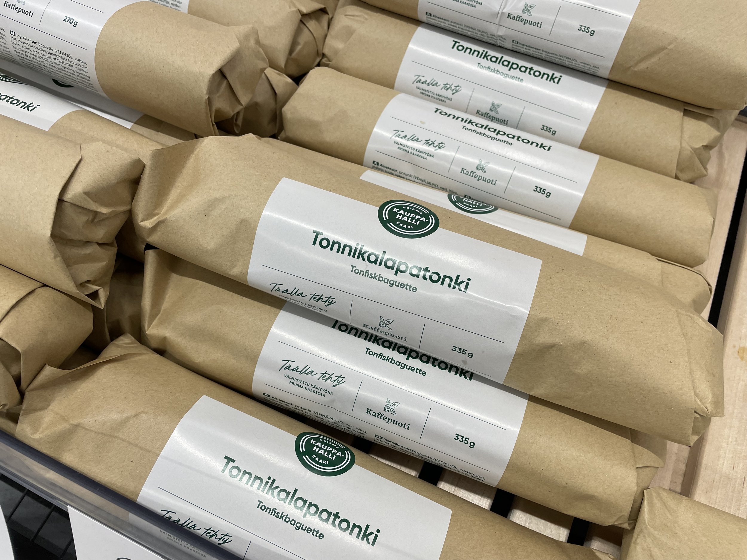
In-store prepared baguettes at Kaari
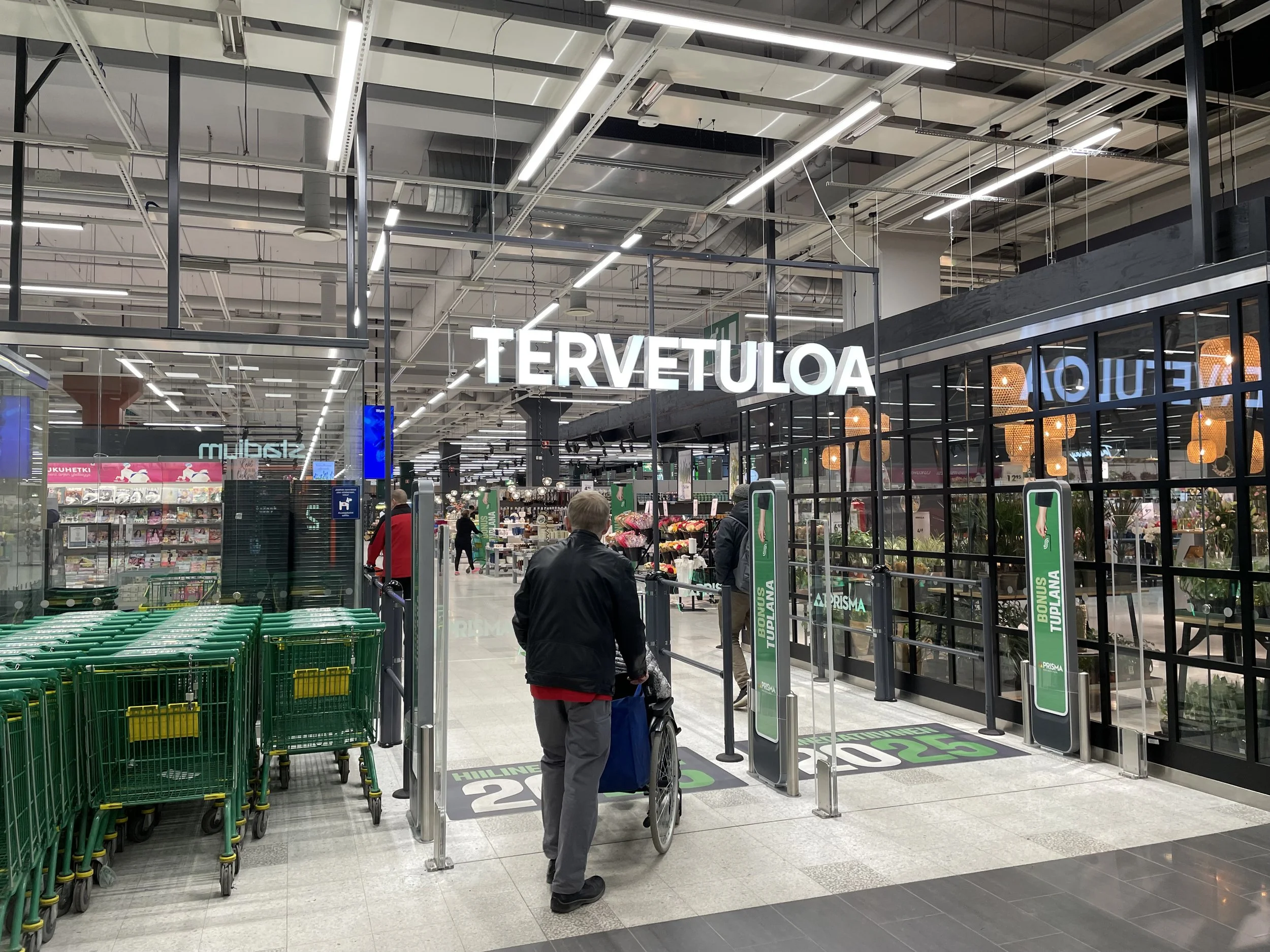
First major change is how food to go is highlighted in the new concept. Because Prisma Kaari is physically a very large store, the main entrance area is dedicated to customers who only want something quick to grab and go. These products include sushi, fresh baguettes and drinks. In Prisma Sello these products are located in much less convenient place inside the store.
Noteworthy is that even though Food to go is mostly prepared in the store, it is clearly communicated to the customers. In Kaari there is still a lot of possibilities to communicate that to the customers even more clearly.
Food to Go section, Prisma Kaari
Kaari
Signage & customer communication
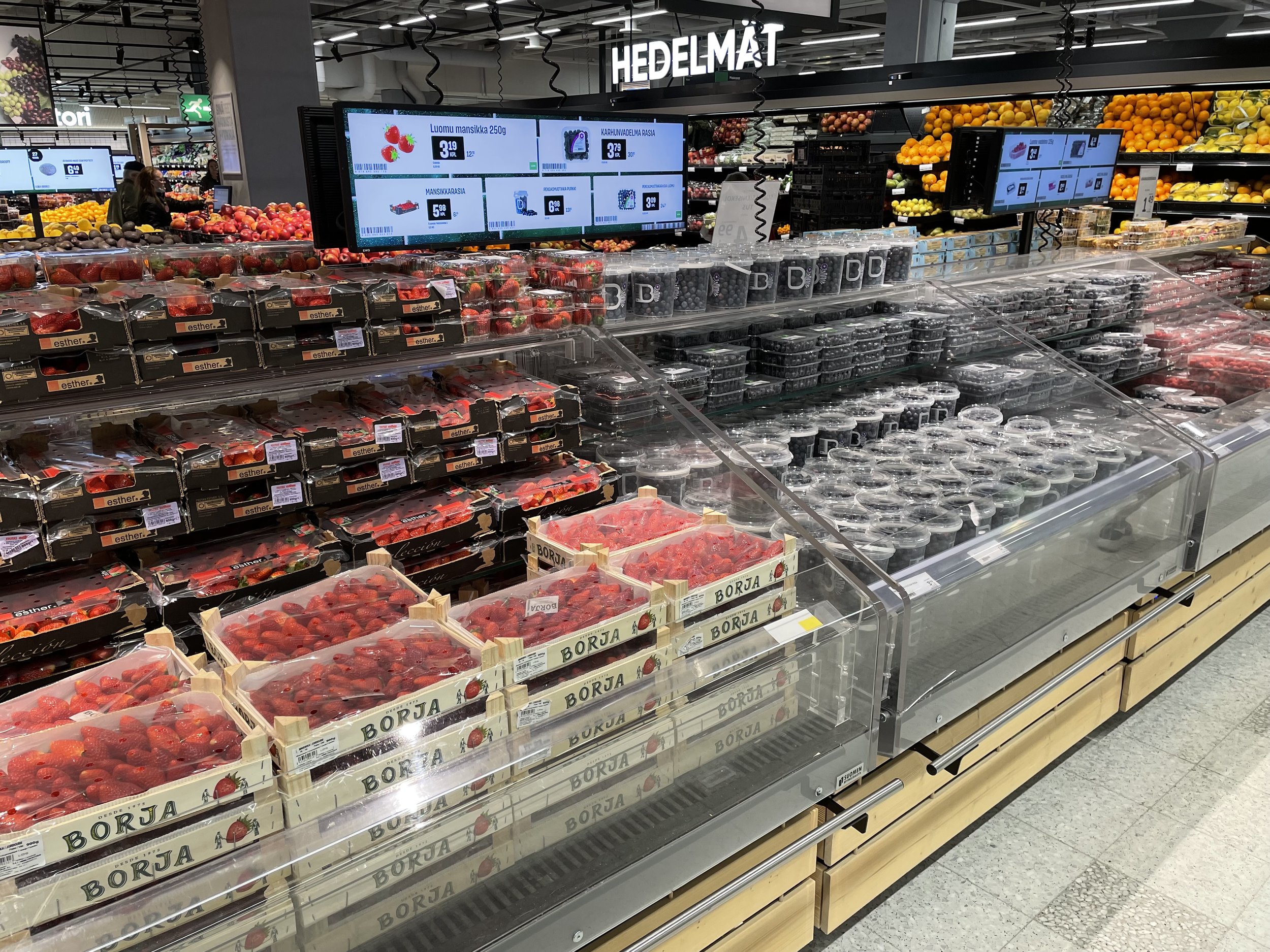
Both stores offer nice examples of customer communication. They provide customers with relevant information about the products and help drive additional sales.
As a whole Prisma is very good at customer communication and signage.
Examples of good customer communication include
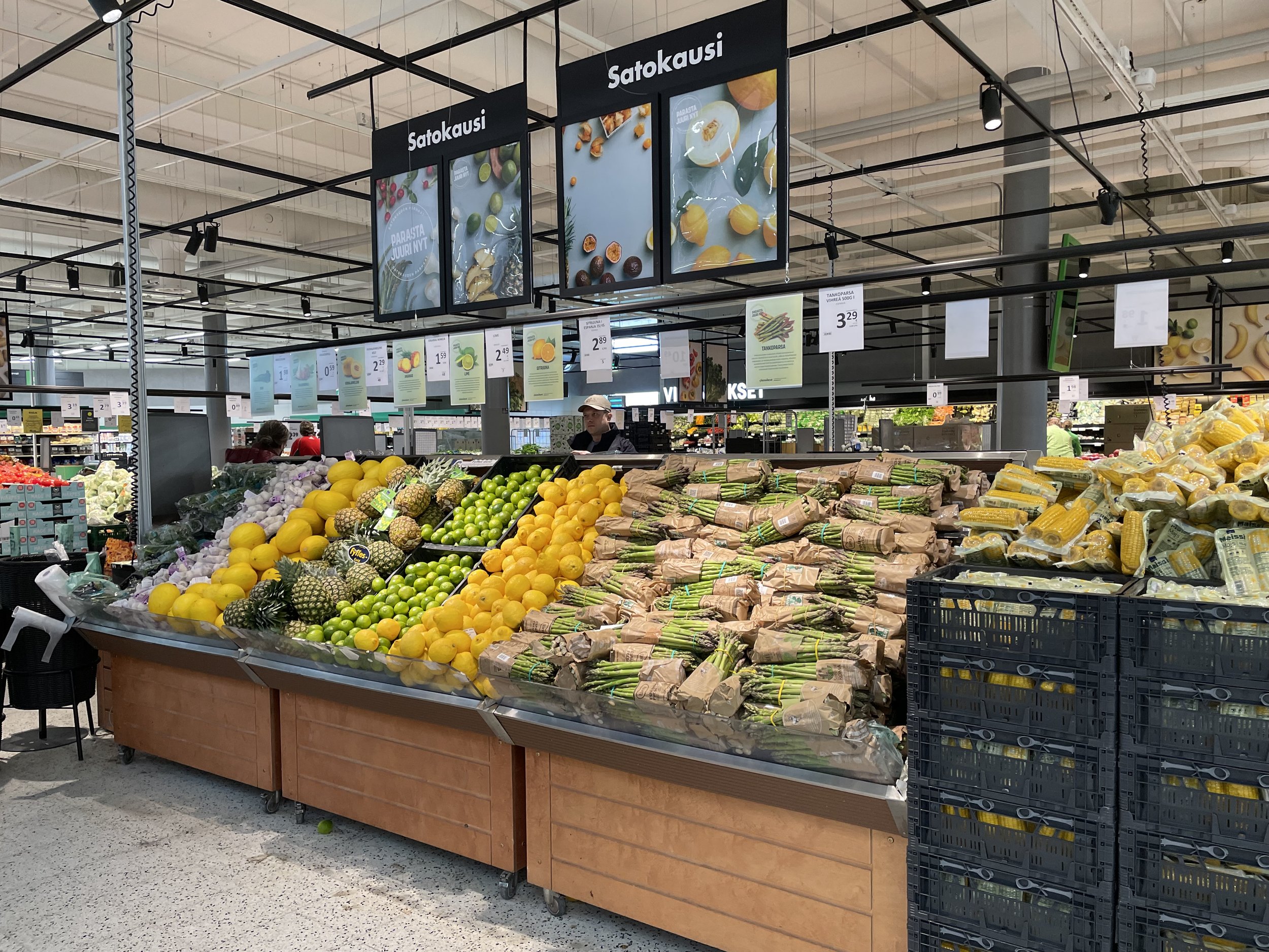
highlighting the seasonality of fruits and vegetables
offering information about different beer types
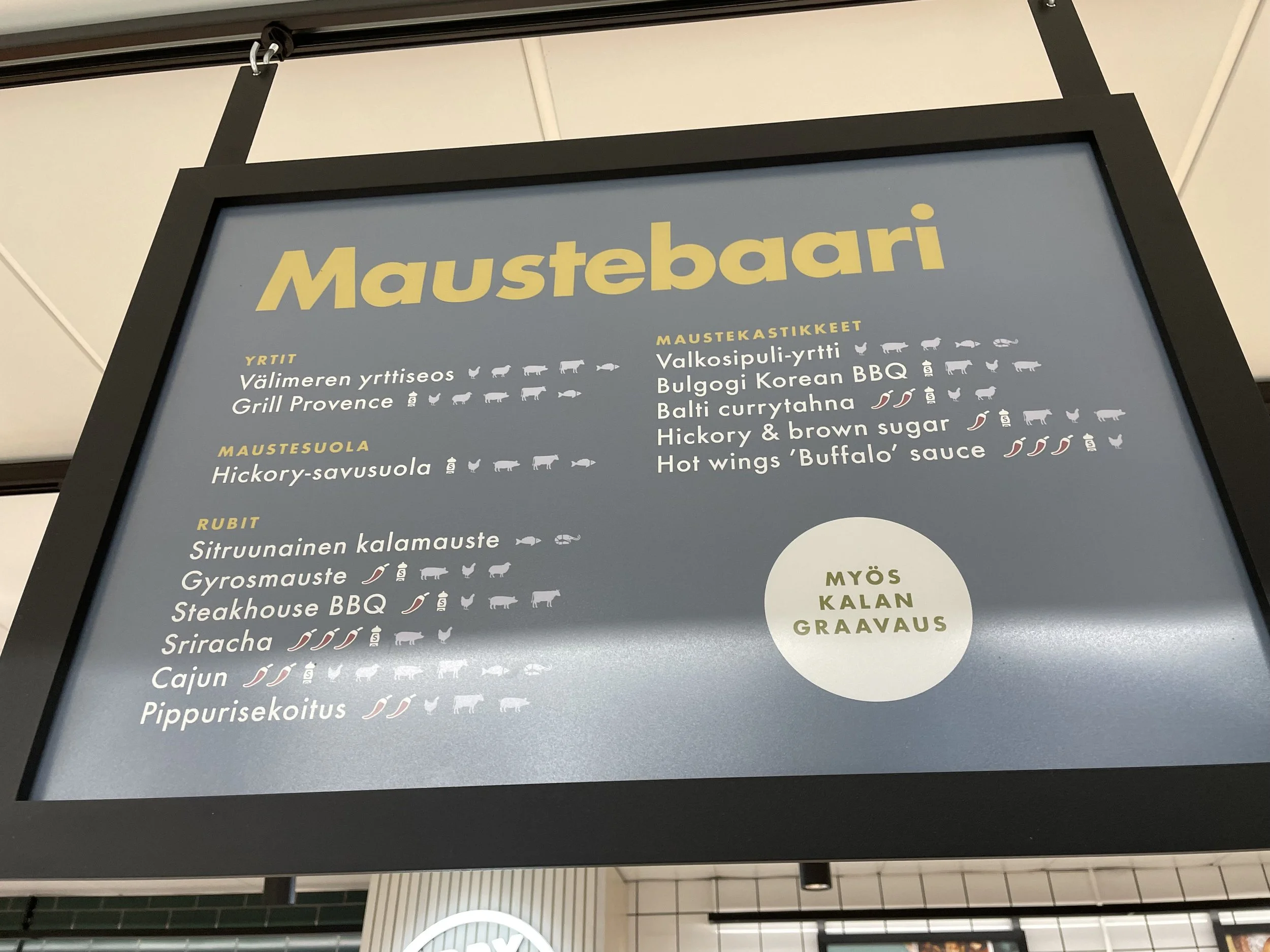
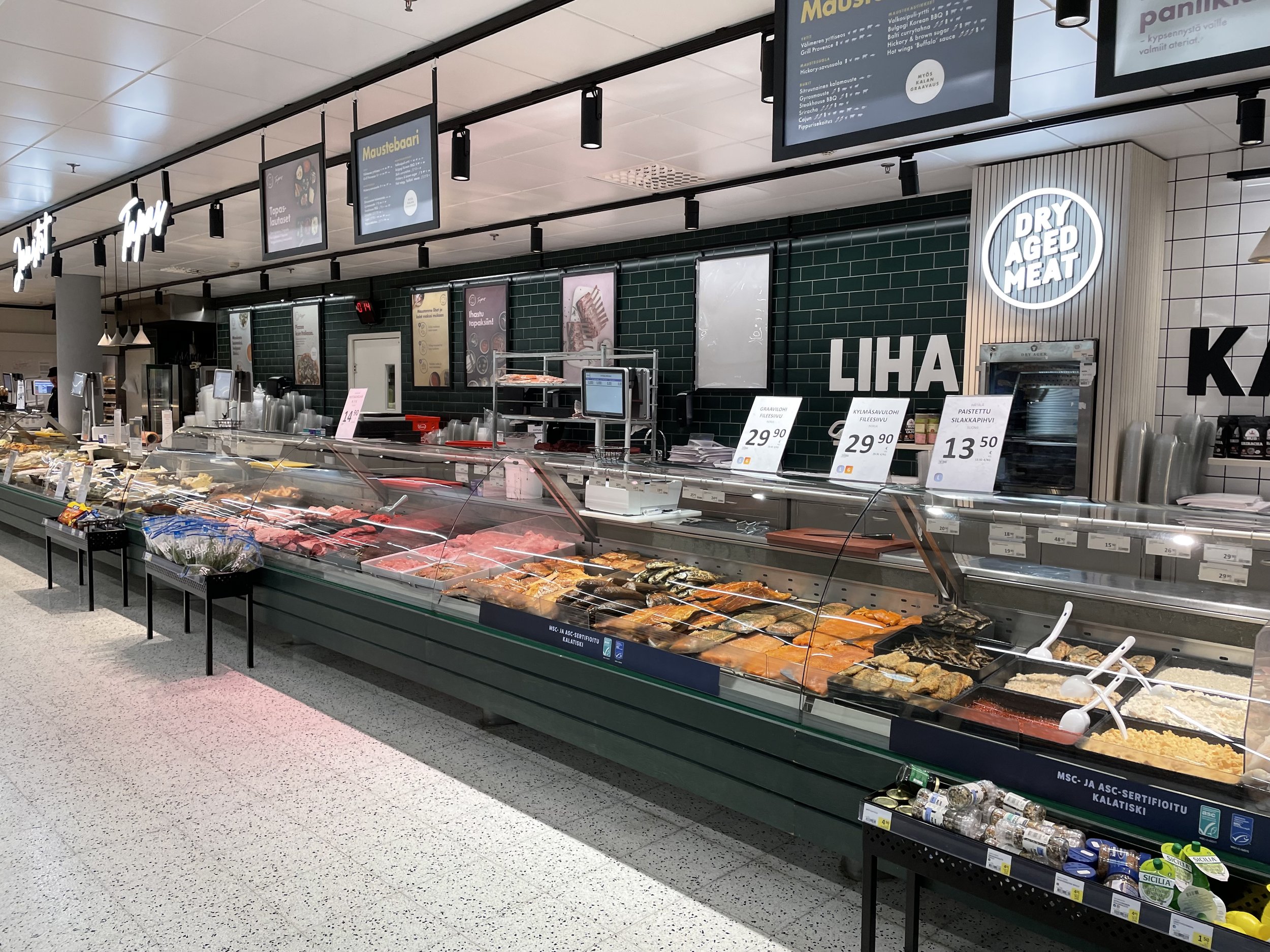
giving customer the opportunity to add spices to their meat from the “spice bar”.
The aim of the communication is to ease the customer journey in the large store and remove friction from the customer experience.
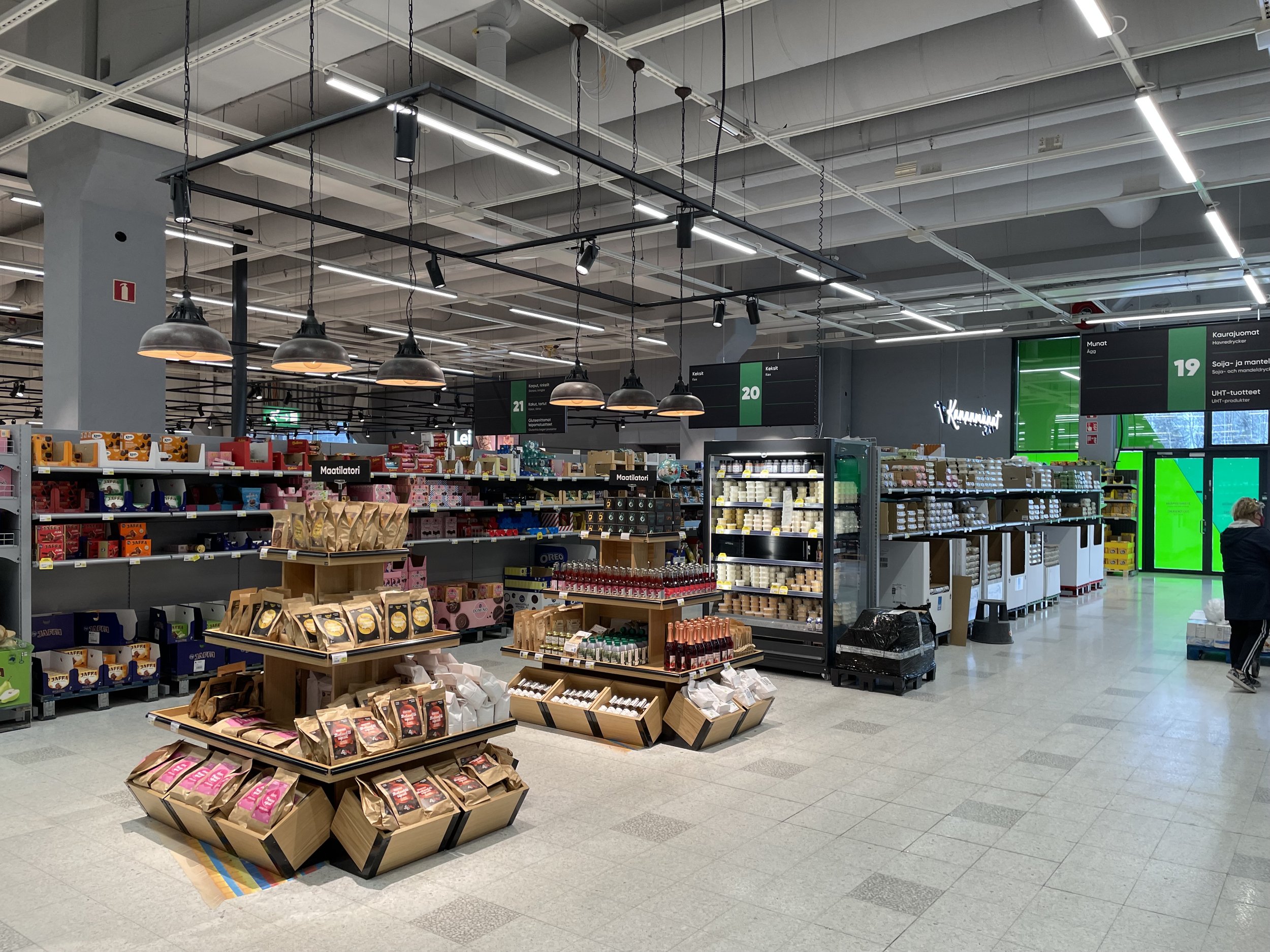
Signage is another example of what the new concept has improved in the store.
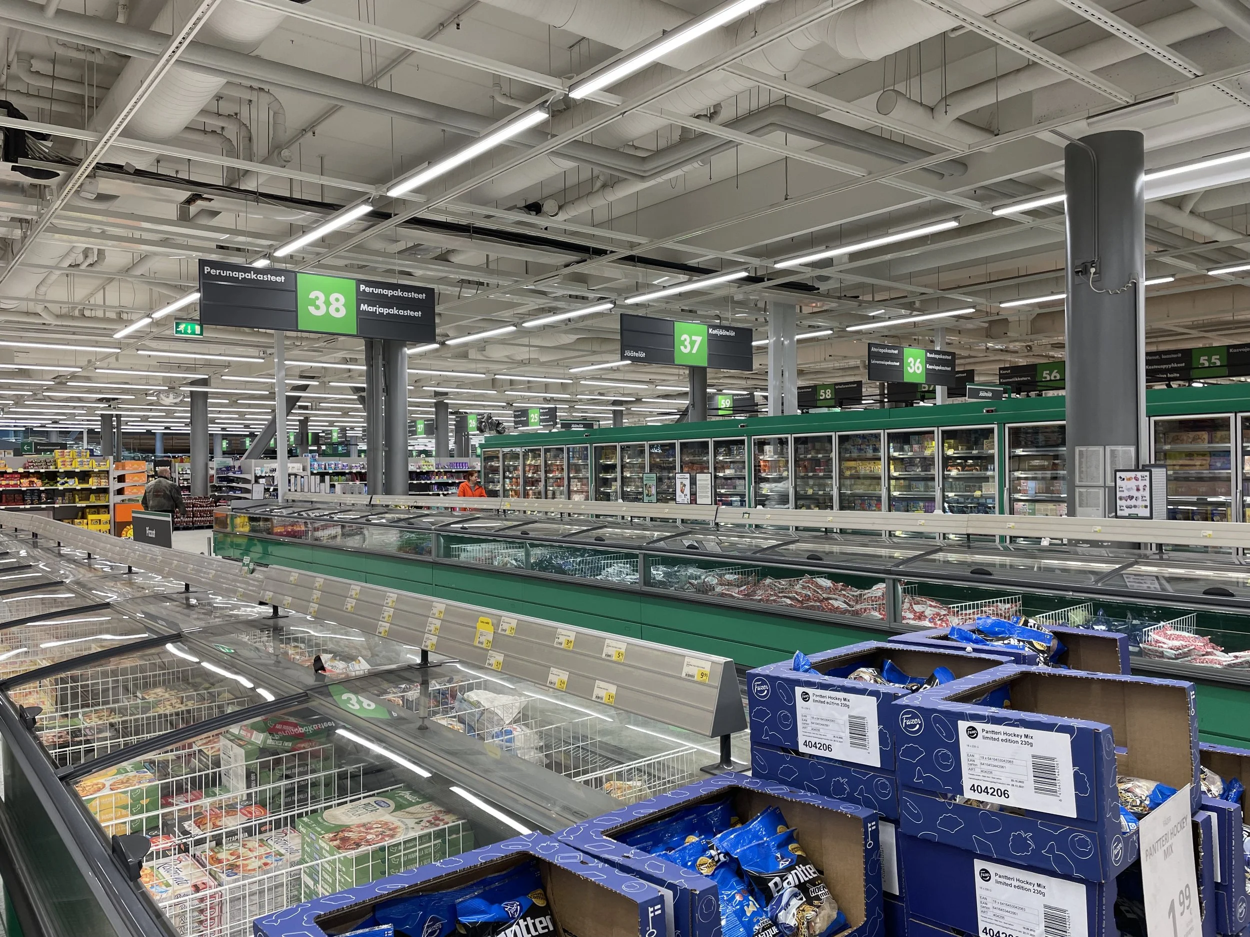
With the older concept in Sello the signage is merely doing its job whereas in Kaari the signage actually helps the customer to navigate and to find products.
This can be seen most clearly in the frozen food department.
In Kaari the signs are cleverly pictures of the products, like a picture of a pizza slice tells the customer where the frozen pizzas are. With one look one can easily see where different products are located. Smart, don’t you think?
Images are a better way of communication and one could wish this was done more in grocery stores.
Prisma Sello frozen food department
Prisma Kaari frozen food department
Summary
Both stores are clean, spacious and big. Prisma Kaari manages to be a bit better in every category. This includes the elements from the new concept, but also how things are managed in the store.
Prisma Kaari is a convincing example of how S-group has upped it’s game with the in-store execution and moved more towards K-Group with regards to the perception of quality. In store restaurants, sushi buffets, large assortments among other things are seen as competitive advantages of Kesko.
It seems that S-Group has started to challenge Kesko’s with Kesko’s own strengths. It is always challenging for a more price led company to start introducing higher quality elements into the store concept without undermining the price image.
Prisma Kaari is doing a good job in improving the in-store experience without feeling like an expensive place to buy.
It will be interesting to see how Kesko can challenge the refurbished S-Group stores.

